A Diferent Christmas
Client / Project
Nou Nadal
Year
2021
NOU NADAL ("New Christmas") was a fictitious campaign built around a real need: helping families experience the holidays safely and meaningfully during the COVID-19 pandemic. The identity supported a program of physical and virtual activities designed to keep the spirit of Christmas alive while respecting the health restrictions of the time; turning a difficult season into a memorable one.
Scope of Work

Concept - Same Values, New Wrapping
Rather than reinvent Christmas, the project set out to express it differently — starting from the same values people already associate with the holidays (family, food, home) and reframing them for a year defined by distance and constraint. The visual direction leans on Swiss graphic design and current geometric trends: a timeless, flat-colour minimalism built to feel both familiar and new.

Unwrapping the Logo
The NOU NADAL logotype rebuilds a modified typeface using simple geometric forms — turning classic Christmas symbols (a gift, a tree, a bauble, a chimney) into a square, a triangle, a half-circle and a rectangle, each carrying its own colour from a four-tone corporate palette. The same logic runs through the entire graphic universe: every shape, colour and icon in the identity traces back to this one system, built to stay legible in colour or black-and-white, on plain or photographic backgrounds alike.



Season's Paperwork
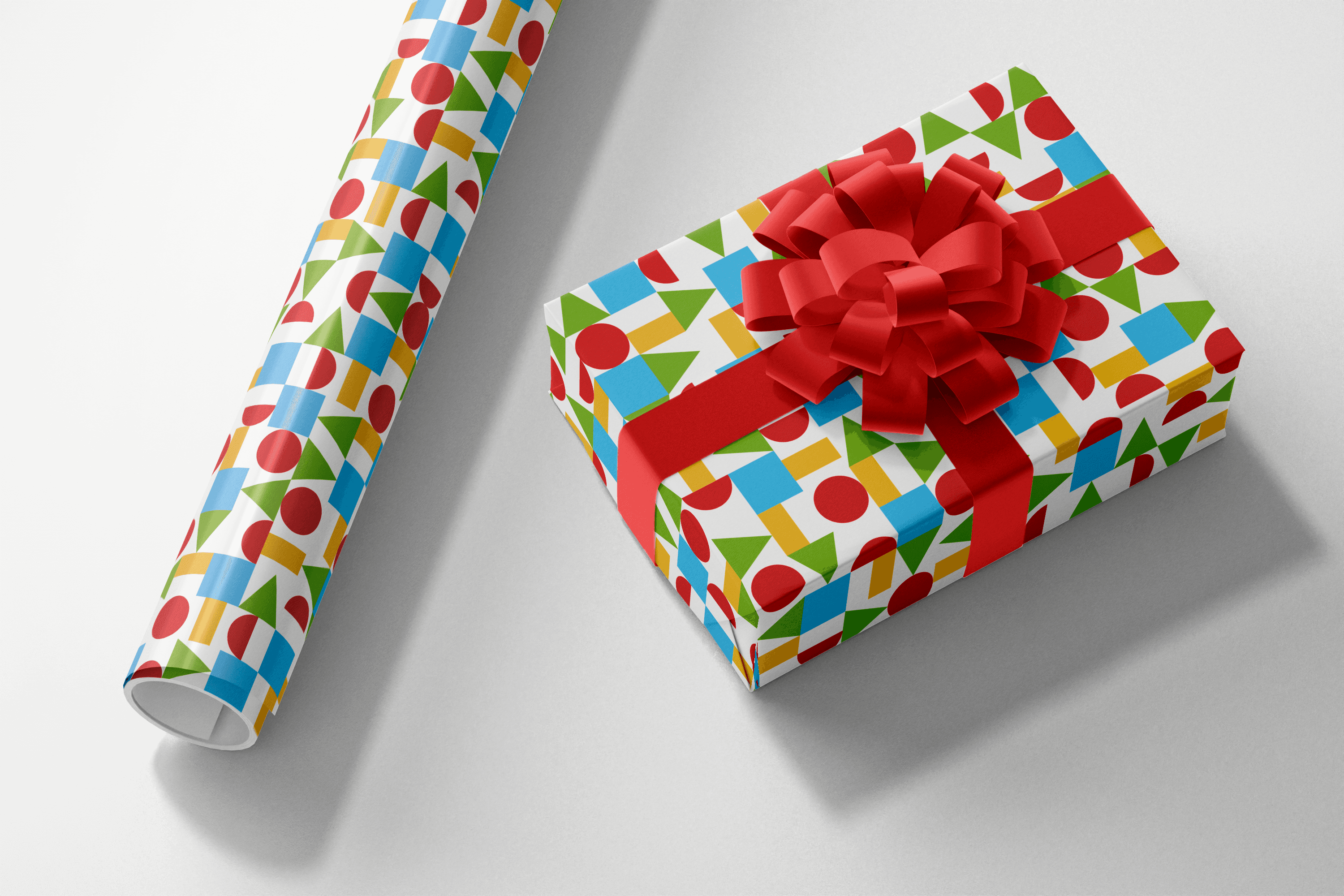
The identity extends into a full stationery system; promotional and affiliate cards, letterhead, envelopes, a tote bag and wrapping paper; with the geometric shapes scattered freely across the wrapping paper as a standalone pattern, and gathered into the fixed logotype everywhere else.



Decking the City
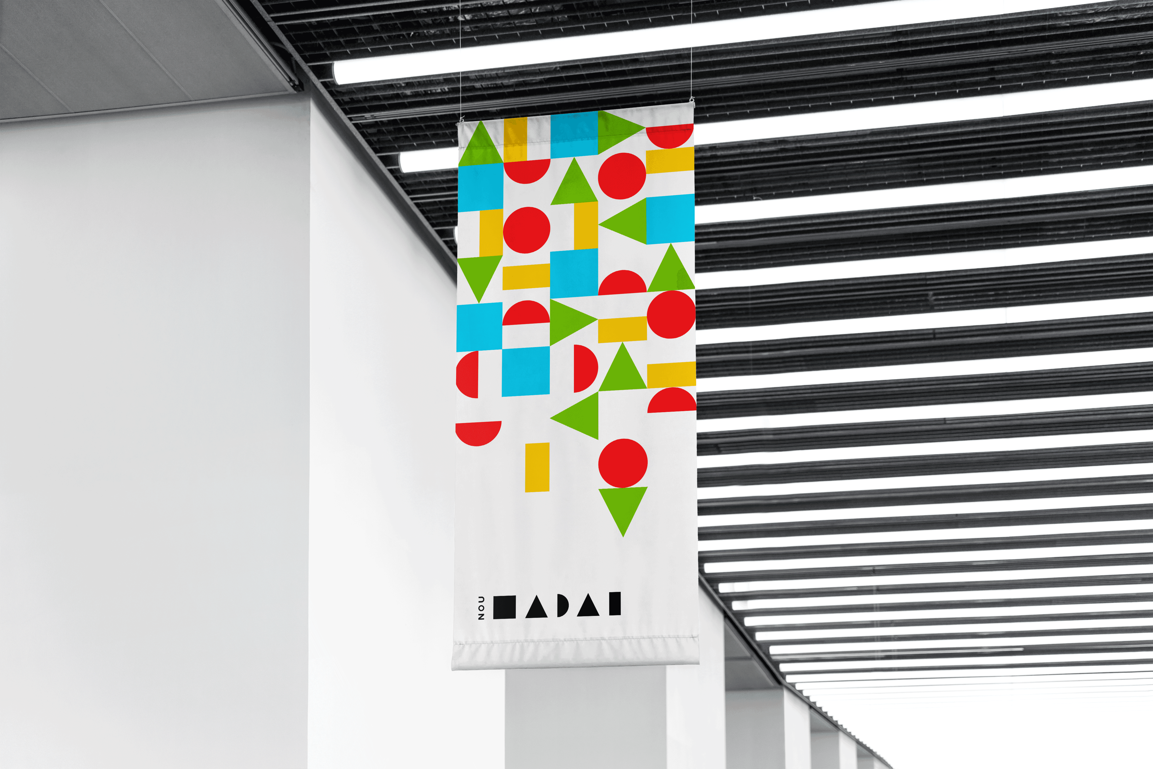
Four messages carry the identity into the city, each built around the same call to action: Fem-ho ("Let's do it"); paired with a different value: close and safe, tidy and special, sustainable and hopeful, different and ours. The system runs across citylights, bus wraps, Bicing bike-share branding and hanging banners, with the bus wrap pulling together every shape and colour from the graphic universe into one full-scale format.
A Little Digital Cheer
A short logo reveal animation and a branded email signature carry the identity into digital and audiovisual formats, using the same geometric build-up as the rest of the system.